Sandwiches Brew
Objective:
Making mobile ordering an easy and informative process.
Project Services:
UI & UX Design
Visual Design
Mobile Website Design
Prototyping
Branding
Software:
Figma
Adobe Photoshop
Adobe Illustrator
Procreate
Google Slides
Project Intro:
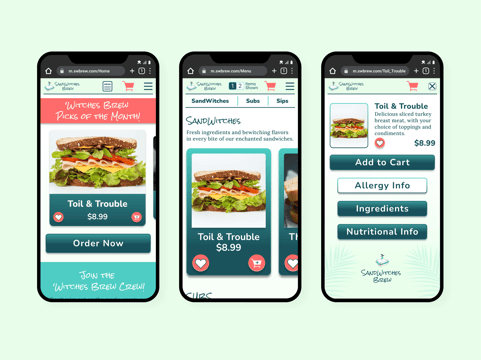
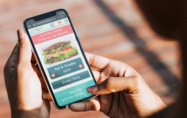
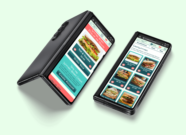
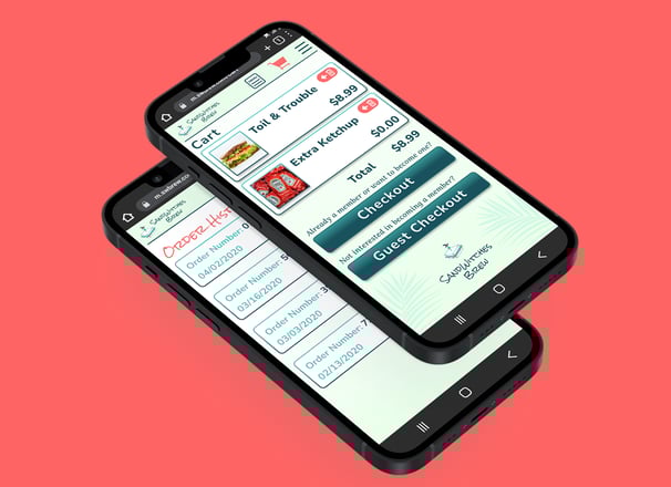
This is a mobile web application for SandWitches Brew, a witch themed sandwich shop based in Clearwater, Florida. This mobile web application allows users to view the menu, sign up for company promotions, and place pickup and delivery orders.
The Problem:
Patrons want to have an easier way to access nutrition information so they can make better informed decisions when ordering from restaurants.
Goal Statement
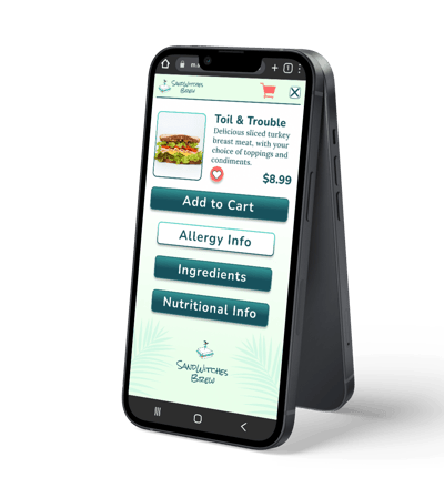
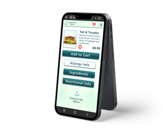
Our mobile-web app will let users easily order healthy meals online which will affect busy, health conscious working mothers by providing nutritional information and meal ingredients in a fun and interesting way. We will measure effectiveness by tracking the number of user clicks on the nutrition info button for each menu item.
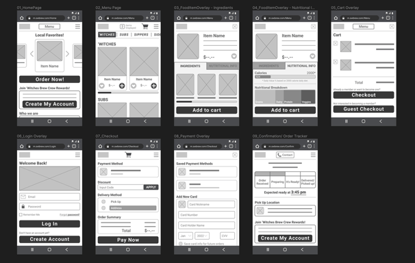
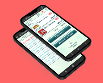
High Fidelity Prototype
Test out the high-fidelity prototype for yourself with this link:
High-Fidelity Prototype
Don't want to review the whole study? Skip to the high-fidelity prototype below:
Project Background
For this project, I created the restaurant concept, designed the branding, researched direct and indirect competitors found in the Clearwater area, completed usability studies with real-life participants, and designed and iterated the entire mobile web app.
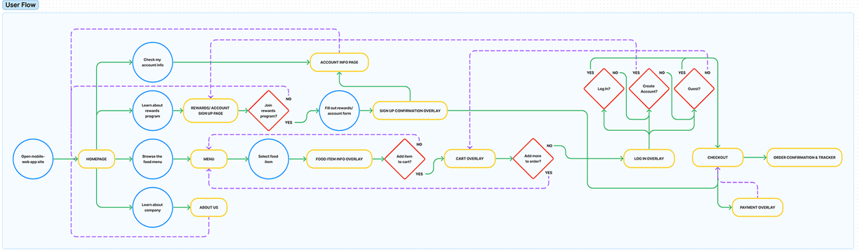
User Flow Chart
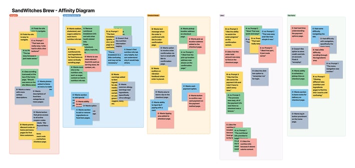
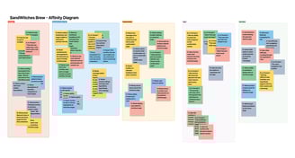
Affinity Diagram
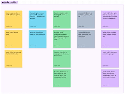
Value Proposition
Research
To better understand my users needs, I conducted user interviews. Through those interviews, I identified a primary user group of individuals that are concerned with the nutritional value of their meals.
The user group confirmed my assumptions that knowing the ingredients and nutritional value of the meals they order online is important, but it also helped me realize another glaring problem. Most online menus that contain this information are too text heavy for small phone screens and can result in accessibility issues with those who have visual impairments. Other issues mentioned included poor order tracking methods and busy schedules making ordering inconvenient.
User 1
User 2
User 3
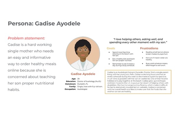
Persona
You can see the results of my studies in the following usability study diagrams and resulting affinity diagram. From that information I was able to put together a persona that represents my target users. Gadise Ayodele is a hard working single mother who is often searching for a quick and easy way to order healthy meals for her and her son, Felix.
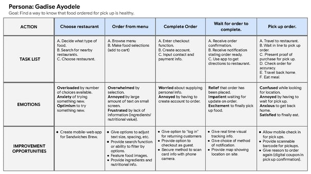
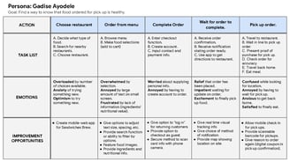
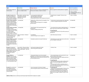
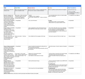
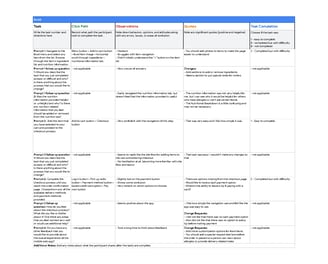
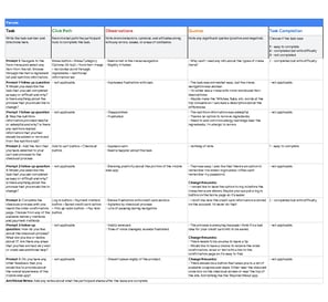
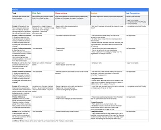
User Journey Map
User Journey Map
The user journey map outlines the steps and interactions a user will experience while engaging with a product, service, or system. The user journey map shown provides a detailed list of steps the user will take towards accomplishing their goal. This user journey map will also relay the emotions felt while completing each task and where there are opportunities for improvement within the process.
UI Design Insights
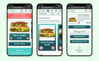
My initial round of sketches focused heavily on the navigation patterns that I wanted to present. My main goal was to offer as much helpful information as I could without overwhelming the user. I found pretty early on that a horizontal scrolling menu gave me enough room to fit many menu items, but wouldn't create the screen clutter that a standard vertical scrolling menu would.
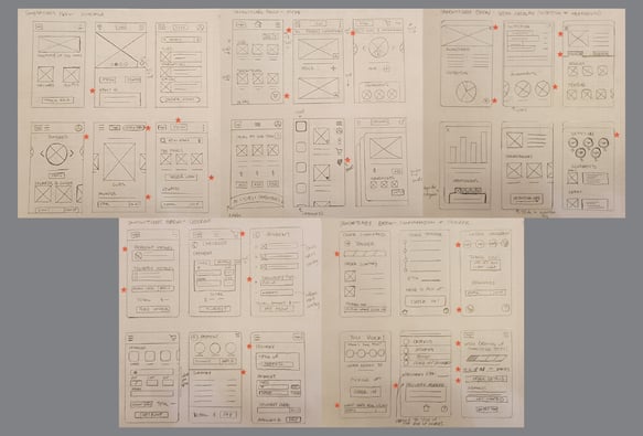
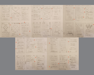
Refined Sketches
Low Fidelity Wireframes
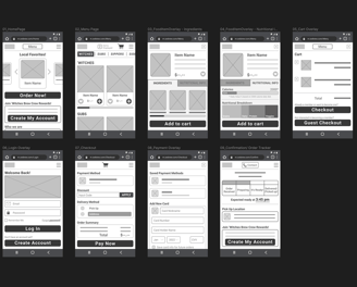
Low Fidelity Prototype
Test out the low-fidelity prototype for yourself with this link: Low-Fidelity Wireframe Prototype
User Testing:
The first round of usability studies helped develop the basic structure for the web app. I was able to focus on the users basic needs and experiment with ways to present it in an efficient manner.
Round 1 findings:
Users want easy access to relatable nutritional information.
Users want to be able to customize their orders.
Users want to have the ability to leave monetary tips.
The second round of studies helped revise my initial designs and resulted in adding additional features that users felt were necessary to provide a complete and rewarding experience.
Round 2 findings:
Users want more commonly found nutrition information.
Users want the ability to schedule their orders for added convenience.
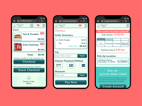
The checkout process needs to be much easier to navigate and less cluttered.
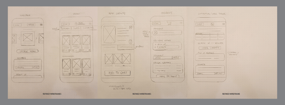
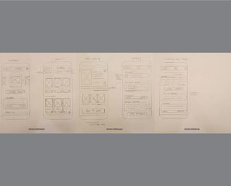
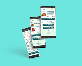
The Solution
With these findings in mind, I then revised the design to also include the following accessibility considerations:
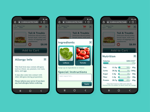
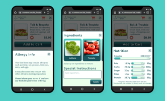
I included the ability to adjust the number of items shown on screen while viewing the menu. When the option to show just one item at a time is shown, the type scales larger and allows users with visual impairments the ability to view text at a much easier to read size.
Ensured that pages containing allergy notice and nutritional information met AAA A11Y WCAG Color contrast requirements for maximum visibility.
Included form labels for all fill-able forms to engage users and provide hints for data input.
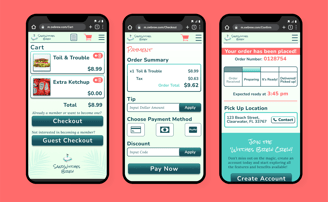
High Fidelity Prototype
Test out the high-fidelity prototype for yourself with this link:
High-Fidelity Prototype

FOLLOW ME ON SOCIAL MEDIA RIGHT NOW: